Overall Design Style
The perfume display stand‘s overall shape uses smooth curves and geometric shapes to outline a dynamic spatial contour. The main colors are deep blue, noble gold, and mysterious purple, creating a luxurious yet trendy atmosphere. Blue elements are presented through textured decorative surfaces, paired with gold metal frames. The design highlights the brand’s premium quality and infuses the space with a modern artistic vibe. The purple base, as a visual support, balances the overall color scheme, revealing a unique personality amidst stability. The floor is also in purple, making four seperate display counters as a whole perfume stand. This color combination not only aligns with perfume’s high-end consumer goods positioning but also creates a strong visual memory point, capturing consumers’ attention.

Spatial Structure
The display stand features a modular spatial structure. There are totally four sperate display counters just cundling together as a whole display stand.
Located in the middle and left of the stand, the curved counters are the primary perfume display area. Each counter top has a white display platform, neatly arranging various perfume bottles. The bottle’s sheen, combined with white and gold display stands, creates a visual focal point. The storage cabinets below provide storage, ensuring an orderly display. The right curved area integrates experience and display functions. The surface features blue and white marble patterns, paired with exquisite fragrance samples for consumers to try perfumes. The area also includes electronic devices (like tablets) that can play brand stories or perfume composition processes, enhancing interactivity.
The blue and white alternating curved facades prominently display the brand logo and name. The illuminated logo design ensures clear brand communication even from a distance, reinforcing brand recognition. Includes a cashier and service desk on the right side. Equipped with cash registers and other devices, it caters to both sales and consultation services, streamlining the consumer process. Although it is small, the layout makes the full usage of the space, which makes it a good choice for high rental place.
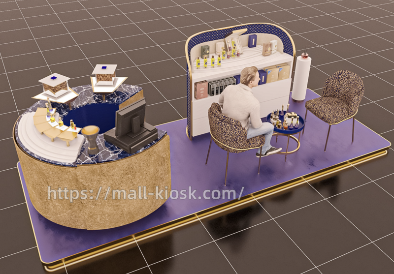
Besides, if you think the layout is too crowded, you can also remove two counters and add a sitting area. With a sitting area, we can introduct the perfume to customers clearly, increasing the conversion rate. The sitting area is sample but confortable. Two comfortable chairs and a short table combination also levers down the decor cost and staff salary.
Material Application
The perfume display stand‘s material selection emphasizes a combination of texture and visual impact.
The whole perfume kiosk extensively uses stone-like, metal, and composite materials. The cabinet’s bady uses plywood, which is suitable for curved style counters. And the counter’s beige-brown surface material is fire-retardant laminate. The surface mimics natural stone, conveying a natural and high-end feel. Also, the mirror gold metal frame not only decorates but also enhances the structure’s delicacy. The counter top uses white man-made stones. This type of material is easy to clean and it highlights the display of perfume bottles. The blue area uses grid-textured materials, metal mesh or special fabrics, paired with lighting to reveal the 3D brand logo. The design creates a visual effect blending reality and illusion. The marble-patterned surfaces add a sense of luxury, matching the high-end positioning of perfume.The purple base uses wear-resistant materials, supporting the stand’s weight and ensuring stability.

Detailed Design
The scent device in the cashier area (like a smoking container) may release the brand’s signature scent, enhancing the immersive experience through olfactory guidance. This multi-sensory design allows consumers to deepen brand memory through smell, in addition to sight and touch. Besides, the counter height and curvature cater to human operational habits. The layered design of the display area ensures all perfume bottle sizes are reasonably showcased. It allows consumers to easily browse and pick up samples without excessive bending or stretching. The angle of the interactive area’s surface is also convenient for arm placement during product trials.