Design Concept
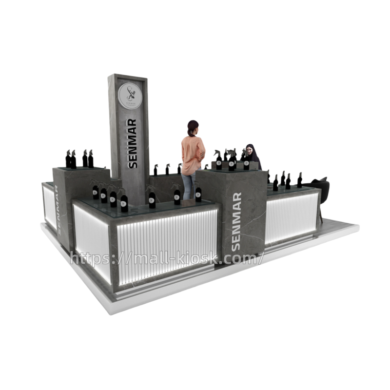
This perfume display cabinet uses simple geometric shapes and a subdued color scheme to create a textured display area. The design revolves around the brand, integrating the brand identity into the cabinet to enhance visual impact.
The main structure stacks multiple rectangular blocks, creating a layered effect with varying heights. The straight lines and right angles of the display platforms provide a neat and tidy visual, subtly dividing the functional areas. This geometric design not only maximizes space but also adds visual tension, capturing consumer attention. The cabinet’s primary color is dark gray, complemented by white illuminated strips that create a low-key luxurious atmosphere. The white light strips highlight product contours with light and shadow contrasts. A prominent brand column with a circular logo at the top and the brand name below forms a visual focal point, reinforcing brand visibility and enhancing brand recognition with a three-dimensional design.

Spatial Layout
The layout focuses on consumer experience, scientifically integrating display, interaction, and rest functions to create a smooth shopping flow. The cabinet uses multi-dimensional display methods with platforms of varying heights. The upper level showcases perfumes on glass surfaces with black bottles, offering a simple yet sophisticated visual. The middle and lower levels use staggered designs to increase display density without visual clutter. The center of the cabinet reserves an open space for interaction. Consumers can freely move around, closely observe perfume details, and engage with staff. This open design fosters a relaxed shopping environment, encouraging consumers to stay, explore, and increase their desire to purchase. A black seating area on one side provides a resting space, transforming the cabinet into a social setting. Consumers can sit and savor the experience after trying perfumes, engaging in deeper conversations, and extending their stay, potentially leading to more purchase decisions.
Spatial layout of the perfume cabinet follows a “circular flow” design, allowing consumers to enter from any direction and view all products without missing any important displays. This design reduces traffic congestion and enhances the smoothness of the shopping experience.
Material Use
The choice of materials balances aesthetic expression and practicality, combining different material properties to create a high-quality display space. The cabinet body uses stone-patterned laminates and white grille wood boards, presenting a natural and upscale marble texture. The simulated stone material is easier to process and maintain than natural stone, offering durability and cost-effectiveness for high-frequency use in commercial settings.
The display platforms are made of transparent glass, showcasing the perfume’s appearance with clarity. Glass not only focuses attention on the product but also enhances the cabinet’s transparency with light reflection. The glass surface is easy to clean, maintaining a tidy display. LED strips are embedded on the sides of the cabinet, using white light that is soft and non-glaring. The strips are installed in a hidden manner, defining the cabinet’s contours and enhancing its three-dimensional effect. The even diffusion of light highlights perfume details and complements the cabinet’s color scheme, reinforcing the brand’s perception of quality.
The bottom edge of the cabinet uses stainless steel for stability and added elegance. Hidden wiring keeps the surface clean and tidy. The seating area uses leather, with black leather offering a soft touch and smooth surface that reflects attention to consumer experience.