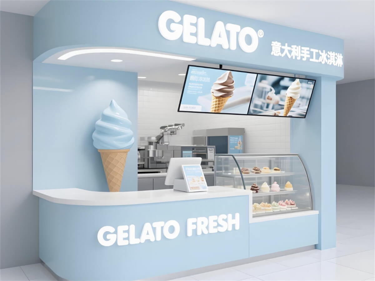
This ice cream kiosk has a modern Nordic look. Soft light blue and white give it a fresh, gentle feel. Curved edges replace sharp corners, so the kiosk looks light and friendly in any mall. The top shows smooth curved lines with hidden LED strips. These lights create a soft glow at night and easily catch people’s eyes. An ice cream sculpture on one side reinforces the dessert theme. This design helps the kiosk stand out in busy malls. An open front keeps the space airy and clear. It also shows ice cream products directly to shoppers, which works great for pop-up stores.
Logo & Color
This kiosk uses light blue as the main color and white as a secondary tone. The palette matches the cool, refreshing feel of ice cream. It also gives off a clean and warm brand image. The logo appears in two places. One is a lit “GELATO FRESH” sign on the front counter. The other is a top curved sign with both Chinese and English brand text. Two logos help people remember the ice cream kiosk better. Lit signs and light blue tones work well together. They keep the kiosk looking consistent during the day and at night. Light blue also fits many mall decoration styles without clashing.

Dimensions & Materials
The main frame of this kiosk uses thick square steel welding. The surface has automotive-grade eco-friendly paint, so the light blue finish resists scratches and fading for a long time. The countertop uses food-grade artificial stone. It resists water and stains, and you can clean it easily. This meets food safety standards without any trouble. The display case uses curved tempered glass with a 304 stainless steel inner tank. Built-in LED lights show the color and texture of each ice cream clearly. All corners of the kiosk have rounded edges to prevent bumps. This design works well in busy mall spaces. You can also change the dimensions to fit mall atriums or corners. This way, the ice cream kiosk fits perfectly wherever you place it.
Display Layout
This ice cream kiosk uses a “front display + back operation” layout. A curved glass display case sits on the right side of the kiosk. It holds different gelato flavors on separate shelves. Clear glass lets customers see the products directly. This view boosts their interest in buying. Open storage shelves behind the counter hold ingredients and packaging, so the work area stays neat. Some models have dual digital menus above the counter. These screens show ice cream flavors and prices clearly. Customers can read the information without getting close, which reduces crowding. The display and operation areas are separate but connect well. This layout keeps the kiosk looking good and the workspace free from clutter.

Operation Flow
This kiosk uses a simple single-in, single-out flow. Staff prepare orders from the back area and pass them to customers over the counter. No paths cross, so service stays fast and smooth. The left side of the counter handles ordering. The right side takes care of pickup. Customers move from order to pickup without turning back, which cuts down on crowding. The back of the kiosk leaves room for ice cream machines and freezers. It also includes a small storage area for ingredients and supplies. This smooth flow keeps the ice cream kiosk running well even during peak hours. As a result, it improves the overall customer experience.

Summary
This light blue curved ice cream kiosk combines modern simple design with a fresh, calming color scheme. Lit logos and ice cream sculptures make it highly eye-catching in mall spaces. Food-grade stone countertops and tempered glass cases meet hygiene standards. They also show off products very well. Thoughtful display layouts and work flows boost service efficiency. You can change the size and materials to fit different mall spaces. This kiosk balances style and function perfectly. It increases brand visibility and draws more customers. Ultimately, it helps ice cream brands drive sales in mall environments.