Design Concept
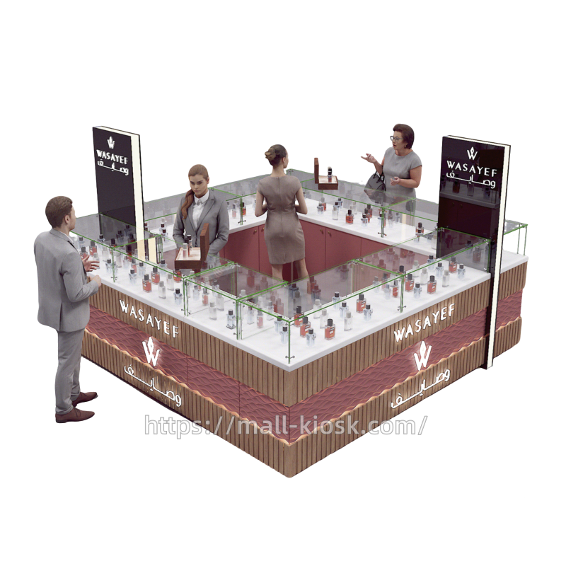
The perfume kiosk takes the brand name as the core visual symbol, prominently featuring it in both languages on the front, sides, etc., to form a strong brand recognition system. The black vertical lightbox sign complements the illuminated letters on the cabinet. That enhances brand recall in consumers through lighting effects. The cabinet uses a soft and layered color scheme. The main wood grain texture creates a natural and warm feel, paired with pink wavy decorative panels. The white countertop is clean and pure, highlighting the delicacy of the perfume products. The transparent glass display case breaks the heaviness of color, making the overall visual more transparent. The cabinet design breaks away from traditional square forms, incorporating wavy decorative elements. The geometric frame structure of the glass display case defines the display areas, ensuring openness while creating a modern feel with neat lines.
Layout Planning
The display cabinet, with the glass display case at its core, uses an open display method, neatly arranging perfumes on the white countertop. The glass cover protects the products without obstructing consumers’ view of details. The layout follows the principle of visual movement, placing high-bottle and special edition perfumes in focus areas. For instance, the wooden tray area in the center of the cabinet highlights featured products or gift sets by raising the display platform. Different fragrances and series are in separate sections. That allows consumers to quickly select based on their needs, improving shopping efficiency.
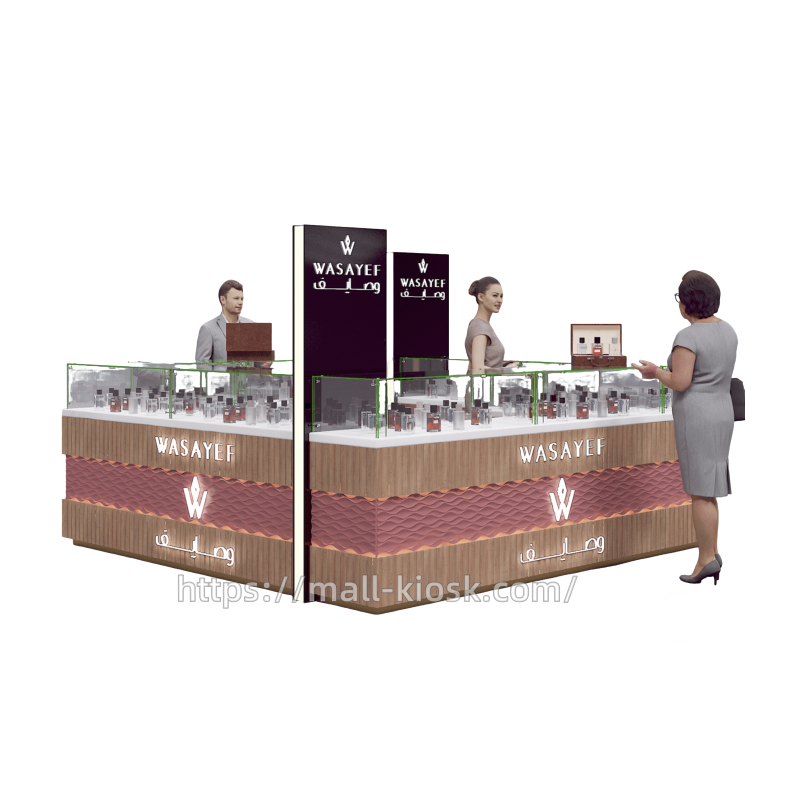
The cabinet interior reserves space for staff movement, facilitating interaction between staff and customers. Some areas are experience stations, like the wooden tray with scent testing papers and trial products. Consumers can experience fragrances up close under staff guidance. This layout creates an open interactive scene, enhancing consumer engagement and aiding in sales conversion. The cabinet’s structure naturally guides customer flow. The external open display attracts customers to browse around, while the vertical lightbox serves as a spatial identifier. The internal staff area and external consumer area are both independent and interconnected. That ensures staff can respond to customers from various directions at any time.
Materials
The display cabinet uses transparent glass as the main display medium. The high-transparency glass clearly presents the perfume’s appearance and enhances the sense of space through reflection and refraction. The metal connectors of the glass frame ensure structural stability while maintaining a clean display effect. The dustproof and collision-resistant properties of the glass protect the products and reduce maintenance costs.
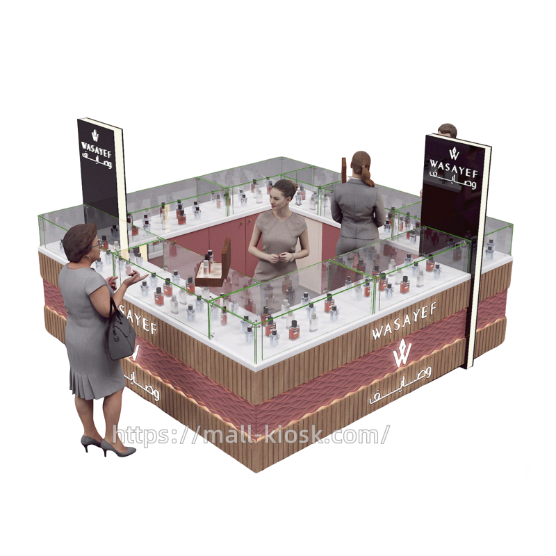
The cabinet body is made of wood, with a wood grain finish conveying a natural and high-end feel, complementing the elegance of the perfume. The pink wavy decorative panels use special techniques, combining high-density fiberboard (MDF) with a veneer process. The craftsmanship of different materials is precise, with smooth joints, showcasing high-quality production standards.
The vertical lightbox is supported by a metal frame for structural integrity and paired with LED light strips for even illumination, highlighting the brand identity. Metal trim on the bottom and edges of the cabinet, like gold thin borders, enhance the overall elegance and reflect quality in the details.