Overall Design Style
The perfume display cabinet features a square and geometric shape with sharp, smooth lines, and a clear, simple outline. The primary color is white, complemented by marble patterns, creating an elegant and pure visual experience. The wavy line design at the bottom breaks the monotony of straight lines. The golden frame structure at the top is one of the visual focal points. The golden metal material enhances the cabinet’s texture and resonates with the high-end positioning of the perfume products. The brand logo “SO MOOD” is embedded in the golden frame, illuminated by lights, further strengthening brand recognition.

Material Selection
The main body of the perfume display cabinet uses high-density boards covered with decorative panels that mimic marble textures. These materials reduce costs while maintaining aesthetics. The boards are finely polished and painted. It makes them waterproof and stain-resistant, easy for daily cleaning and maintenance.
The product display area extensively uses transparent glass. The glass display cabinet has high transparency, clearly showcasing the perfume bottle design, color, and packaging details. The edges of the glass cabinet are with sanding for safety and to enhance overall quality. The coolness of the glass contrasts with the warmth of the white cabinet, enriching the visual layering.
The golden metal frame serves as both a decorative element and a structural support. Metal is strong and durable. After antioxidant treatment, it resists rust and fading, ensuring the cabinet remains new-looking over time. The combination of metal, glass, and boards displays a fusion of industrial aesthetics and commercial display.

Display Layout
The display cabinet uses a layered design, creating a three-dimensional display space with glass cabinets of varying heights. The interior is divided into multiple functional areas. The left-side independent glass cabinet is for featured products or sets. The middle open area can hold trial or promotional items. The front glass cabinet highlights core products. This zoning method meets the need for product categorization and guides consumers to explore all items, extending their stay.
The product arrangement is avoiding clutter. Proper spacing between perfume bottles emphasizes individual items and keeps the display neat. The white space design improves visual comfort and focuses consumers on the products, conveying a high-end and refined atmosphere.
Lighting Design
The bottom of the cabinet is embedded with a linear light strip, emitting soft white light that outlines the cabinet’s shape and illuminates the surrounding floor, enhancing its presence in the mall. The light stripes at the bottom work with the top ambient lighting to ensure even brightness and avoid shadows on the products.
Hidden spotlights are inside the glass cabinet. The light focuses on the perfume exhibits, highlighting the bottle’s luster, color, and details. The spotlights’ color temperature is close to natural light, accurately restoring product colors and creating a warm, upscale atmosphere. The light’s diffuse reflection minimizes glass glare and improves the viewing experience. The soft lighting, combined with the white cabinet and golden elements, creates a warm and luxurious shopping atmosphere. The layered lighting design makes the cabinet stand out in the mall, offering an immersive brand experience.
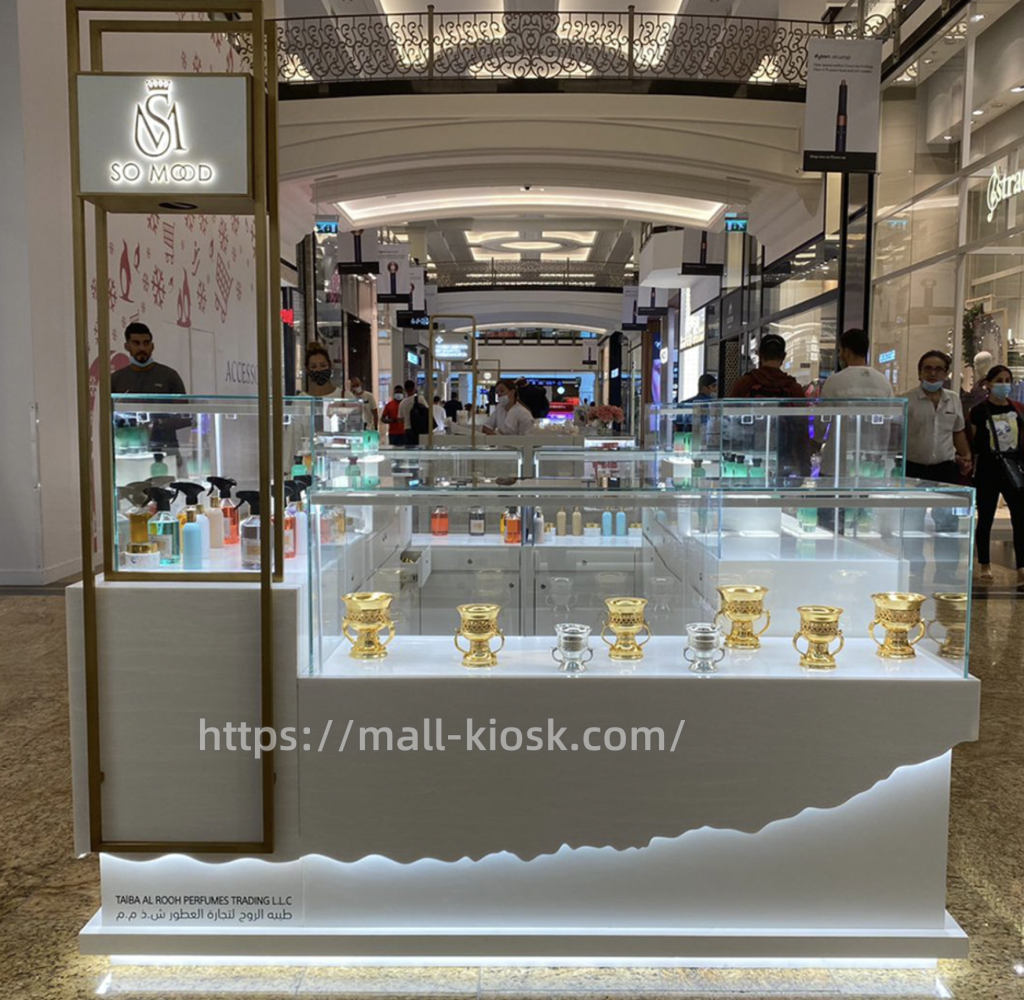
We also get feedback photos from our clients. From photos, we can see the whole perfume kiosk stands out in the mall. The lights and the advertising board really attract the customers’ attention. All the goods show their best in the ultra-clear glass stanns neatly and clearly. With MallKiosk, you can get your unique kiosk. Don’t heasitate to ask us.