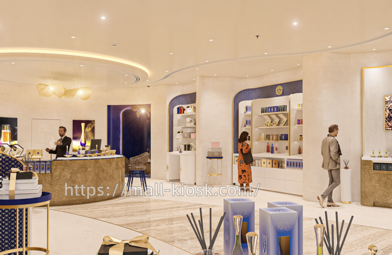
In the Middle East, where perfume culture runs deep, this perfume store has become a pilgrimage site for fragrance enthusiasts with its unique design and profound brand essence. From its visually striking exterior to its meticulously crafted interior, the perfume store blends traditional aesthetics with modern design, offering an artistic journey that engages all senses. Here’s a deep dive into the store’s unique charm from various dimensions such as brand positioning, spatial design, display layout, and user experience.
Brand Positioning
The store’s name, “Abdul Samad al Qurashi,” and its Arabic counterpart, signal a brand deeply rooted in Middle Eastern culture. The region has long been a hub for spice trade, boasting a rich heritage of fragrance culture. Such brands often carry the weight of family tradition or historical significance. The overall design style, from the blue and gold color scheme to the exquisite decorations, conveys the brand’s tone of “luxury” and “classic.” The store targets customers who seek a high-quality lifestyle and are passionate about unique fragrance cultures. Whether local or global tourists, stepping into the store immerses one in the brand’s homage to traditional fragrance art and its interpretation of modern luxury experiences.

Exterior Design
The store’s exterior features deep blue as the primary color, complemented by gold decorative lines, creating a strong visual contrast. The deep blue background is adorned with delicate dot patterns, adding a sense of sophistication and depth, while the gold elements enhance the luxurious feel, in line with perfume’s status as a high-end consumer good. The brand name on the sign is illuminated, ensuring it stands out in the mall environment. The bilingual Arabic and English signage reflects the brand’s balance between local culture and international vision.
The entrance employs an open design with glass doors and windows framed in gold, combining transparency with elegance. The door frame incorporates curved elements to soften the harshness of straight lines, creating an graceful transition space. The columns in front of the store are also primarily deep blue, with surface decorations echoing the dot patterns of the exterior walls. The bottom is embedded with a light strip, further enhancing the depth and refinement of the space. The overall exterior not only showcases the brand’s unique identity but also invites customers in with an open gesture.
Interior Space
Inside, the main colors are off-white and light beige, creating a warm and elegant atmosphere. The marble flooring, with its natural and smooth textures, complements the light-colored walls, enhancing the space’s quality. Some areas like the display stands and columns continue the exterior’s deep blue and gold elements, achieving visual unity. For example, cylindrical columns with deep blue bases and gold decorative lines serve both as structural supports and decorative highlights.
The ceiling features curved light strips that softly outline the space, avoiding the harshness of traditional spotlights. Flush-mounted downlights are evenly distributed, providing basic lighting and ensuring clear product display. In the display area, focused lighting highlights the gloss and details of perfume bottles. The unique pendant lights in the consultation area, composed of gold spherical elements, emit a warm glow, creating a comfortable experience atmosphere. The layered lighting design offers both bright and transparent public areas and private, cozy corners.

As seen in the floor plan, the store uses an open layout with curves guiding customer movement, avoiding the abruptness of right-angle turns. The central area features a large circular display stand, surrounded by multiple functional areas. In the central display area, circular counters with high stools allow customers to sit and experience fragrances. The store lines the walls with multi-level shelves, categorically displaying different perfume series. The white-based shelves with gold frames are simple yet luxurious, with neatly arranged products for easy browsing. Display stands near the entrance showcase popular fragrances for customers’ initial contact. The checkout counter is connected to the back storage area, ensuring service efficiency. The store also features fragrance experience devices (like scent-emitting decorative columns) to enhance the immersive experience. Some walls are embedded with electronic screens showing brand stories or fragrance creation processes, enriching customer knowledge.
Display Design
The display of perfume bottles in the store is highly artistic. The central display stand uses a blue and white marble surface with gold decorations, showcasing variously shaped perfume bottles. Some bottles are primarily purple and gold, echoing the space’s colors. The display stand also pairs with related products like aroma sticks and gift boxes, creating a scene-based display that conveys the concept of a “fragrance lifestyle.” The shelving area uses layered displays, with the same series grouped together, and bottle colors arranged from light to dark, offering both aesthetics and ease of comparison for customers.

Wall decorations incorporate abstract art inspired by Middle Eastern elements like spices and deserts, resonating with the fragrance theme. Some display areas have hanging gold decorative lights with modern yet elegant designs, becoming visual focal points. Brand logos on counters and columns reinforce brand recognition. These detailed designs not only enhance the aesthetic experience but also convey the brand’s cultural depth.
User Experience
As a perfume store, the olfactory experience is paramount. The store has fragrance diffusion devices that continuously release the brand’s classic scents, enveloping customers in fragrance upon entry. The central experience area offers fragrance testing services, where staff use professional tools (like scent strips and decant bottles) to help customers explore different scents, breaking down top, middle, and base notes for a deeper understanding of fragrance.

The elegant space design and exquisite product displays offer visual pleasure. Touching the texture of perfume bottles and feeling the fineness of packaging materials further enhances the experience. For instance, some bottles are made of frosted glass or metal, and gift boxes are packaged with silk ribbons, creating a sense of luxury that links touch with sight and smell.
Staff are dressed formally and focused on customer service. Whether proactively introducing products or patiently explaining fragrance knowledge, their professionalism is evident. The comfortable seating in the consultation area allows customers to enjoy one-on-one consultation services, receiving customized fragrance recommendations based on personal preferences and usage scenarios, turning the shopping process into a personalized fragrance exploration journey.
Attention to Detail
From the marble flooring, metal decorative lines, to the glass material of the display cases, every material choice emphasizes quality. For example, the counters are made of textured stone, which is both natural and wear-resistant; the gold frames of the shelves are finely polished to avoid sharp corners, showing care for the customer experience in the details.
The design of the brand logo and the spatial color scheme all reflect the Middle Eastern cultural heritage. Deep blue and gold are classic colors in traditional Middle Eastern architecture and handicrafts, symbolizing nobility and mystery. Decorative patterns and art in the store may also draw from local cultural symbols, allowing customers to experience the rich cultural heritage while enjoying fragrances.