Colors and Logos
- Color Scheme: Green and white are widely used. Green is Subway’s brand color, giving people a fresh, natural and healthy feeling, which is in line with the brand’s emphasis on fresh ingredients. White enhances the brightness and cleanliness of the space.
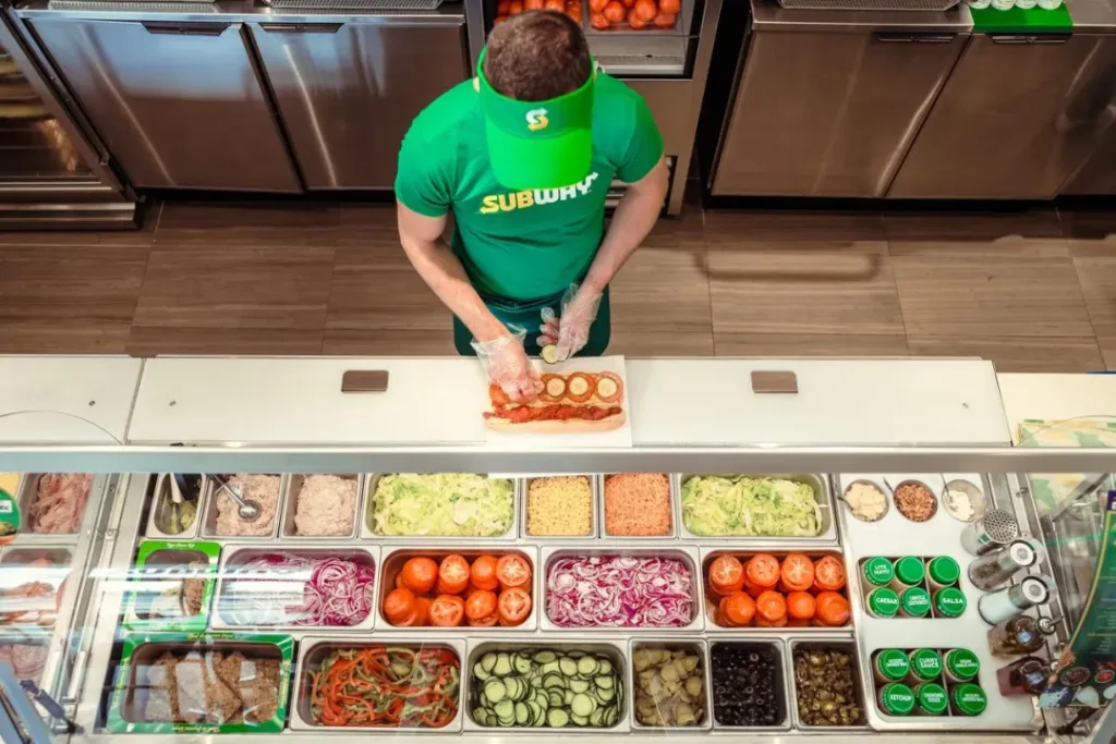
- Brand Logos: The iconic “S” – s haped logo of Subway can be seen in many places in the store, such as on the staff uniforms and the glowing signs in the ordering area. This strengthens brand recognition, allowing customers to clearly know that they are in a Subway store as soon as they enter.
Layout and Functional Zones
- Ingredient Display Area: In the first picture, the open – ingredient display area is located in front of the operating counter. Various fresh ingredients are neatly placed in transparent partitioned containers, making it convenient for customers to directly see the types and freshness of the ingredients, and also easy for employees to access. This display method not only increases the attractiveness of the food but also reflects the brand concept of “fresh customization”.
- Ordering Area: In the second picture, the ordering area is located in the center of the store, with multiple electronic display screens above it for showing the menu, new product recommendations, and promotional information. This design can clearly convey product information to customers, facilitating their ordering. Compared with traditional paper menus, electronic display screens are more convenient to update, and can promptly adjust product and price information.
- Operation Area: The operation area is located behind the ordering area. Employees make food within the customers’ line of sight. This open – style operation method increases customers’ trust in the food – making process and is also in line with Subway’s transparent and fresh brand image. The operation area is equipped with necessary equipment, such as slicers and ovens, to meet the needs of food production.
- Sales Area: On both sides of the ordering area, there are special areas for displaying and selling snacks like potato chips and beverages. This makes it convenient for customers to buy these items when ordering, increasing additional sales opportunities.

Lighting Design
- Overall Lighting: Bright overall lighting is used in the store, making the whole space look clean and tidy, and creating a comfortable dining environment for customers. The lights on the ceiling are evenly distributed to ensure sufficient light in all areas.
- Accent Lighting: In the ingredient display area and the ordering area, lights are used purposefully to highlight the displayed contents. For example, the lights in the ingredient display area can make the ingredients look fresher and more appealing; the electronic display screens and glowing signs in the ordering area are more eye – catching under the illumination of the lights, attracting customers’ attention.
Promotion Design
- Signs: Many signs are set up in the store, such as “NOW FRESHLY SLICING” and “FRESHLY SLICING”, emphasizing the feature of freshly sliced ingredients, which is an important selling point of Subway. These signs use eye – catching colors and fonts to quickly catch customers’ attention.
- Electronic Display Screens: New product recommendations, promotional activities, and package information are shown through electronic display screens, promptly conveying the latest discounts and product updates to customers, and attracting them to try new products and promote sales.
Overall, the design of Subway stores is centered around the brand concept. Through a reasonable layout, eye – catching logos, appropriate lighting, and effective promotion methods, a consumption environment that is both comfortable and highlights the brand characteristics is created.